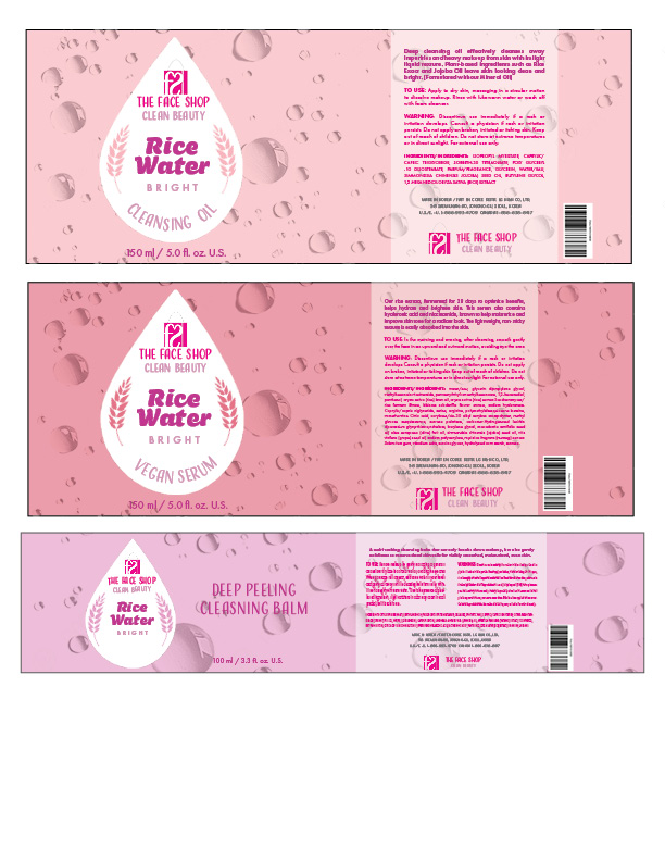
Packaging – Creating dynamic labels that use very conceptual ideas that immediately capture the consumer’s attention. Using typography, color, and hierarchy to deliver the concept.
Manic Panic
Manic Panic is a vegan/cruelty free semi permant hair dye. With the original packaging, it was a jar product, and the design highlighted the brand name. However, it was a very simple design, and it didn’t really capture that it’s a hair brand product.
This is a rebrand of the product, and the container type was changed to a squeeze pouch to allow more room for the design. As well as trying to capture more audience attention. The design is trying to play with the brand name. With “Manic”, the design plays on showing it as a hair brand by using the color to show through hair and the silhouette of the hand with hair dye brush. With “Panic”, the design plays on a horror aspect by using a horror movie character to display the color and using the hand silhouette as a horror movie aspect.
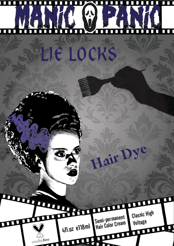
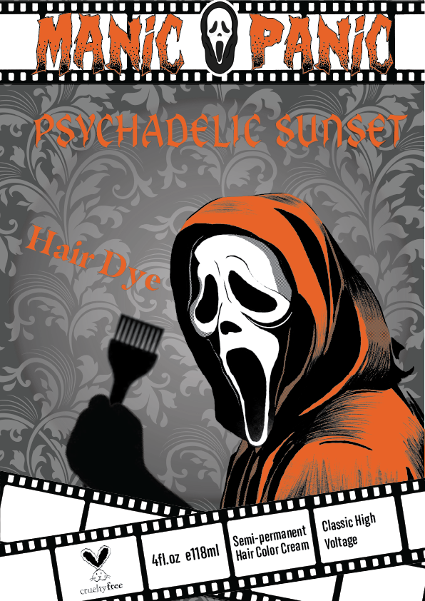
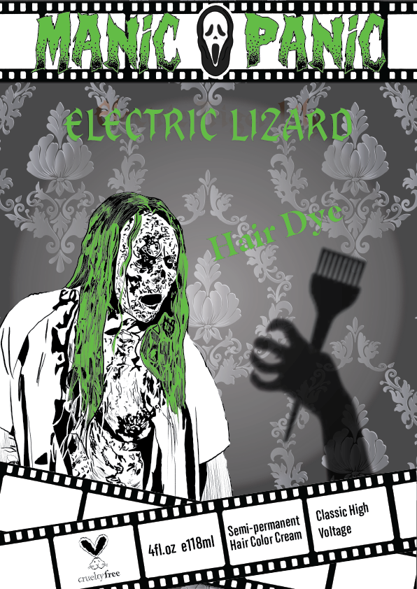
Manic Panic Rebrand Design (3 variations), (dimensions), Digital Design
The Face Shop
This is a project to make labels for the skincare brand. I want to make something to highlight what makes this brand different from other brands: the rice water.